


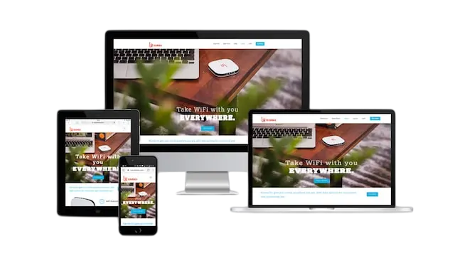
This is the website which looks greaty on both smart phones and Computers. You can view the website on both screens.
A responsive website is a site designed to automatically adjust its layout, images, and content to fit different screen sizes and devices — whether it’s a desktop, tablet, or smartphone. This ensures that users have a smooth, consistent experience no matter how they access the site.
📌 Key Features of Responsive Websites
- Flexible layouts – Use grids and percentages instead of fixed pixels so elements resize naturally.
- Media queries – CSS rules that apply different styles depending on screen width or device type.
- Responsive images – Images scale or swap depending on the viewport size.
- Viewport meta tag – Ensures the browser displays content correctly on mobile devices.
- Adaptive typography – Text sizes adjust based on screen dimensions for readability.
🌍 Why It Matters
- Improves user experience by making navigation easy on any device.
- Boosts SEO rankings, since search engines prioritize mobile-friendly sites.
- Increases conversion rates, as visitors are less likely to leave due to poor usability.
- Saves development time and cost, since one site works across all devices.
Leave a Reply